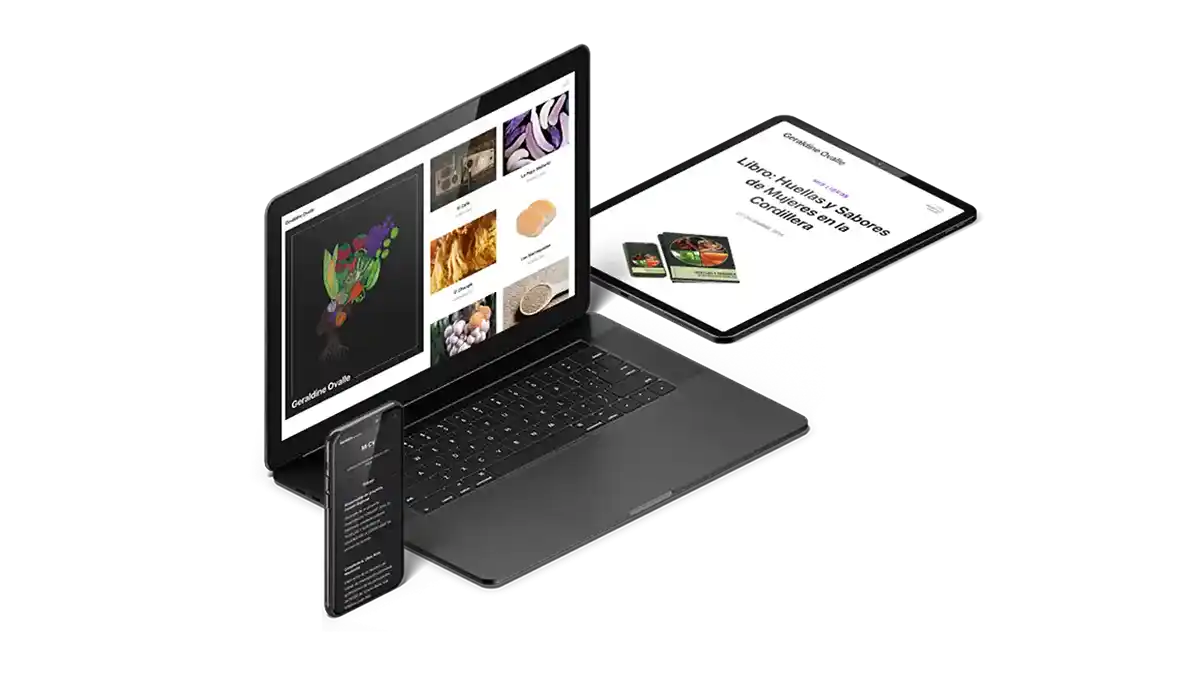
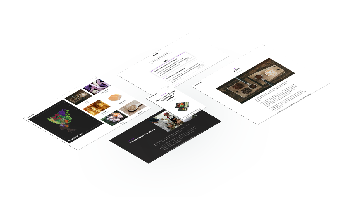
Minimalist Site For Chilean Professor

Geraldine Ovalle wanted a new design for her website in preparation for launching and focusing on her new projects. The new website needed to be clean, modern, minimal, and fast. It was also necessary to optimize for internet searches, for greater visibility.
For this project I selected the Splitian template from the Publii Content Management System (CMS) as the base of the site. I then brought the essentials from the old site into the new design. We keep the emblematic logo of the previous versions.

In addition to the CV, classes and workshops present in the previous version of the website, we added a section for her publications, which include the Huellas y Sabores website, the Chilean Heritage & Culture book y el eBook: Huellas y Sabores.
Technical Details
- Highlight color is the same purple as previous versions of the site - #7D14C0